
+copy.jpg)
+copy.jpg)


The floor is not going to be concrete, I just haven't finished that yet.
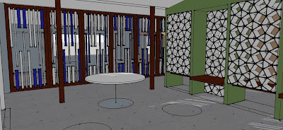 focus concentration area
 focus movement area
creative

The skin on the outside of the windows on the creative bldg is going to move to the inside. It just seemed kind of tacked on. The stair railing will become glass panels that the kids can draw on. There will be a trellace overhang above the stage on the outside of the bldg to break up that wall and to allow for lights and such to be attached when the stage is used outside.


These look good - a few comments:
ReplyDelete1. The focus spaces seem to have more architectural texture which in my mind stands in contrast to the notion of focusing your attention on an activity versus focusing attention on your environment. The images of the spaces at the top of the page seem more calm.
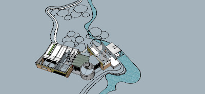
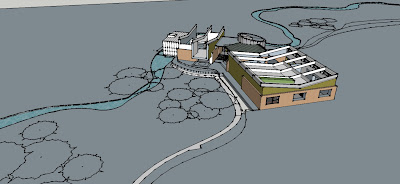
2. For aerials: make sure to either leave all roofs on or take all off - this seems to be half and half. For these images it is also important to show some kind of 3D tree, whether in sketchup or post production with a montaged tree in photoshop with 40% opacity so the emphasis can still be on the buildings. Given the flatness of the landscape however, and your attention paid to the trees I think this is important.
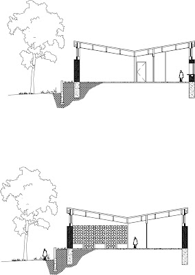
3. Sections: while I think adding textures on the surface parallel to the cut plan is important, I think the drawings themselves will read more clearly spatially if you do a solid poche for the ground that extends at least half the height of the building along the full width of the drawings (medium grey or black) and that you either pump up the cut lines at the section so there is a greater contrast with uncut lines or that you poche the walls being cut.
ReplyDelete4. Scale figures: because it is a school scale kids are important, but all drawings should have at least one scale adult so that we can use it is a proportional measure of the size of your buildings. Also, feel free to get figures in active positions and not just standing.
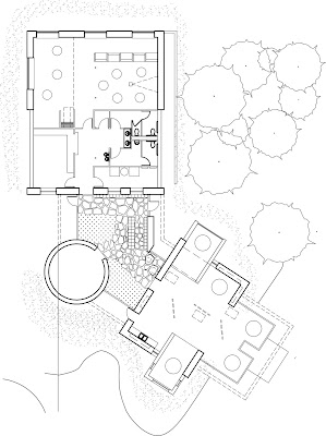
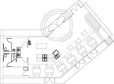
5. The top plan has a nice amount of detail in it, though I am concerned that the interior partitions are not reading as walls but as half-height or partial density. Can these be shown with either a bit more thickness or with darker cut lines? I would bring the plan at the bottom of this page up to the same level of detail. For your site plan you can strip back some of the level of detail, or perhaps just show the building as roof plans.
6. Perspectives - I think it important to show figures in positions that suggest the different use of the spaces, even if you don't fully populate a view (four kids versus twelve)